Local + Organic on Wheels
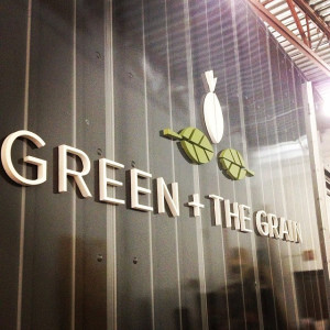
Designing the logo for Green + the Grain was a delight. A pretty dedicated consumer of fresh, organic food myself, it makes my job pretty darn fun when a project is right in line with my own lifestyle.
I worked with one of the owners, and her vision was very targeted from the start. She wanted something that felt very fresh and organic, yet still sleek and sophisticated. The feel overall was described as ‘where rustic meets modern’.
I provided concepts as I usually do with some accompanying logo applications, because I think choosing a logo is impossible if you can’t see how it will work on stuff.


The final concept I developed works well in its full-logo format, but also creates the opportunity to use the symbols on their own.
Yum? Find out where you can try some of their inspired, healthy salads or try their organic signature tart frozen yogurt with fresh toppings:
Twitter @GreenNtheGrain
Facebook | Instagram
Photos: Green + The Grain Facebook Page

