Logo design, illustration, and website design
This project was a delightful one. Combining my skills in illustration and logo design along with web design was so fun. Starting from scratch and working closely with my clients, I was able to bring this lovely brand to life for lovely people.
What is “bare” honey, anyway?, you might wonder. Dustin and Grace Vanasse are entrepreneurs who are making honey in the purest way: By breeding (locally) big healthy bees that create the healthiest honey around. The end product: Treatment-Free Honey. You’d be surprised what the honey industry is getting away with these days. You can find out more details on their website.
In a nutshell, their honey is: “No Pesticides. No Antibiotics. No GMO’s. No Chemicals. All Natural and Treatment Free.”
But I can attest to taste: their honey is just better. It doesn’t have the overly syrupy flavor that a lot of commercial honeys do, which from my understanding is due to the fact that the Bare Honey is never mixed with anything extra, like corn syrup. (Rumor has it a lot of imported honey is not pure honey — eek!) Also, the bees on Bare Honey farms are never given antibiotics or other unnatural treatments to help them survive. You can also connect with the Bare Honey Facebook Page to get more information on this pivotal Treatment-Free honey movement.
The sweet process
It all started out meeting with Dustin and Grace, and just tasting the honey, talking about what makes it truly different, and what their visions were for the brand. I understood right away that I was dealing with a truly unique product, and the brand could be nothing less than that. Some of the words used to describe what we were after are: Nurturing, pure, smart, playful, unconventional, local and glowing.
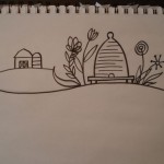
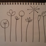
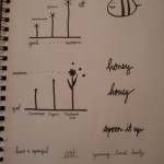
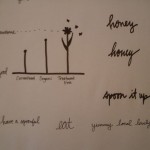
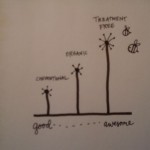
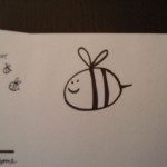
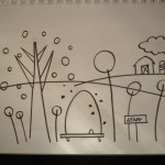
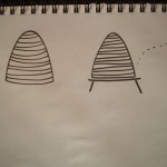
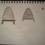
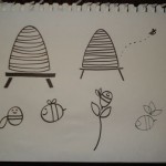
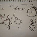
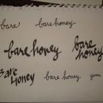
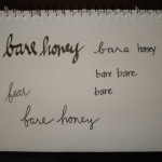
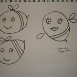
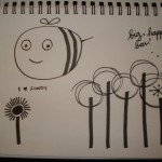
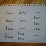
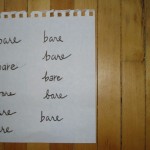
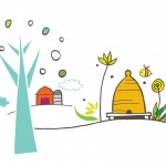
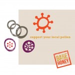
What I envisioned was combining illustration, vivid color, all complimented by a restful, clean white background. I spent a lot of time sketching and illustrating different logos, farm scenes, beehives, flowers, pollen, and the like:
I got to enter my “happy place” quite often during this project. Time flies when I’m drawing.
From the illustration work, I extracted 3 different theme variations, of which they liked the most fun, illustrative one (also my favorite).
Website planning & design
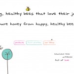
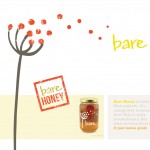
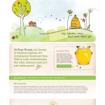
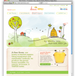
It is an interesting challenge to translate a brand, especially one so steeped in the sense of taste and texture, to the web. It’s almost with a story-telling like feel that the homepage opens up with an outdoor illustrated scene as well as the a photo of the actual product — bringing the two worlds together.
The site also includes a retail area, a map with hive, store and restaurant locations, and more information on what Beyond Organic / Treatment Free means.
So, check it out. Barehoney.com. Buy some honey online, or stay tuned for availability on store shelves or CSAs near you.
