Care, honor, love, give.
The annual gala is held in the spring each year. This year the gala benefits patients at the newly opened J.A. Wedum Residential Hospice.
I was hired to give the benefit a fresh new look, and one they could use over the next few years and simply change the color palette each year.
I created a logotype for the event, which highlights the word hospice:
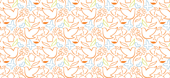
And along with the logotype, I created a hand-illustrated pattern using my ink pen, which I then created a repeating pattern with fresh hues of orange, blue and green.

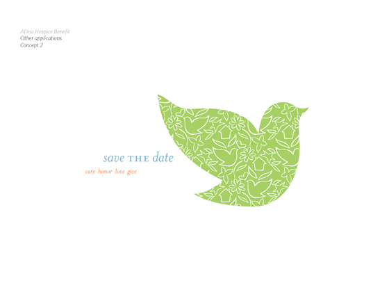
The pattern has flexibility. It can be changed in color, or pieces of the illustration can be pulled out on their own, as I displayed within the concept presentation:
The overall feel is uplifting. The event isn’t a sad one, but the challenge with designing for a hospice benefit is that “hospice” inherently has a grave tone as it does relate to the passing of life. But Allina’s approach is that hospice is about being able to enjoy life — however long or short the rest of it may be — and being able to provide people with a wonderful, beautiful, well-built and safe place to do that.
For more information, visit Allina’s website.


