Competition is fierce.
And TChek knows it. This rebranding project was necessary for TChek Systems to stay current, as well as attract new types of clients as they branch out into the executive-level corporate world with their new expense tracking tools. Ackmann & Dickenson, a local website and application development company, brought me in as the branding expert and lead creative director on this project.
SaaS: From the Ground Up
We started from the ground up with redefining the brand, which guided the redesign of the logo, website and most importantly, the application. This software as a service (SaaS) needed to be in alignment with the rebranding effort as well as provide a whip-smart, super clean user experience. The main company website design followed closely on the heels of the application design.
From Inside, Out
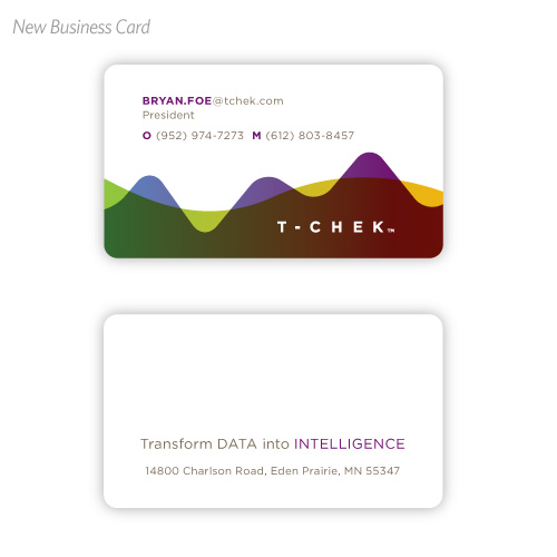
Your basic marketing collateral was also included in this project, such as business card and letterhead design and PowerPoint templates. There were also designed collateral on the customer side. TChek’s other main product is providing large distribution companies with fuel cards for their drivers to use. I designed some card options that fit within the graphic look and feel of the new TChek.
The Concept Behind the New Look
Since TChek is all about tracking spending, the new logo is less about the “check” and more about the actual business of displaying information easily and graphically. The logo represents the combination of a virtual card and charting/tracking. This chart-like graphic is then used as a graphic element throughout the system. The look is clean with vibrant color, which is used intentionally to guide the user experience through the application. A brand shouldn’t feel like a set of handcuffs and rely solely on its logo to create the overall look. Instead, I wanted to provide some freedom within the brand to use just the type treatment on its own when the graphic element is strongly used — like on the business card.


