Mar 13, 2026 | Blog, Graphic Design
So, I’m a Xennial. We’re the micro-generation that was raised between analog and digital worlds, and we’re pretty comfortable with mad swings and huge shifts in technology and life. When I was 8, I remember my mom yelling at me not to jump on the hardwood floor near...
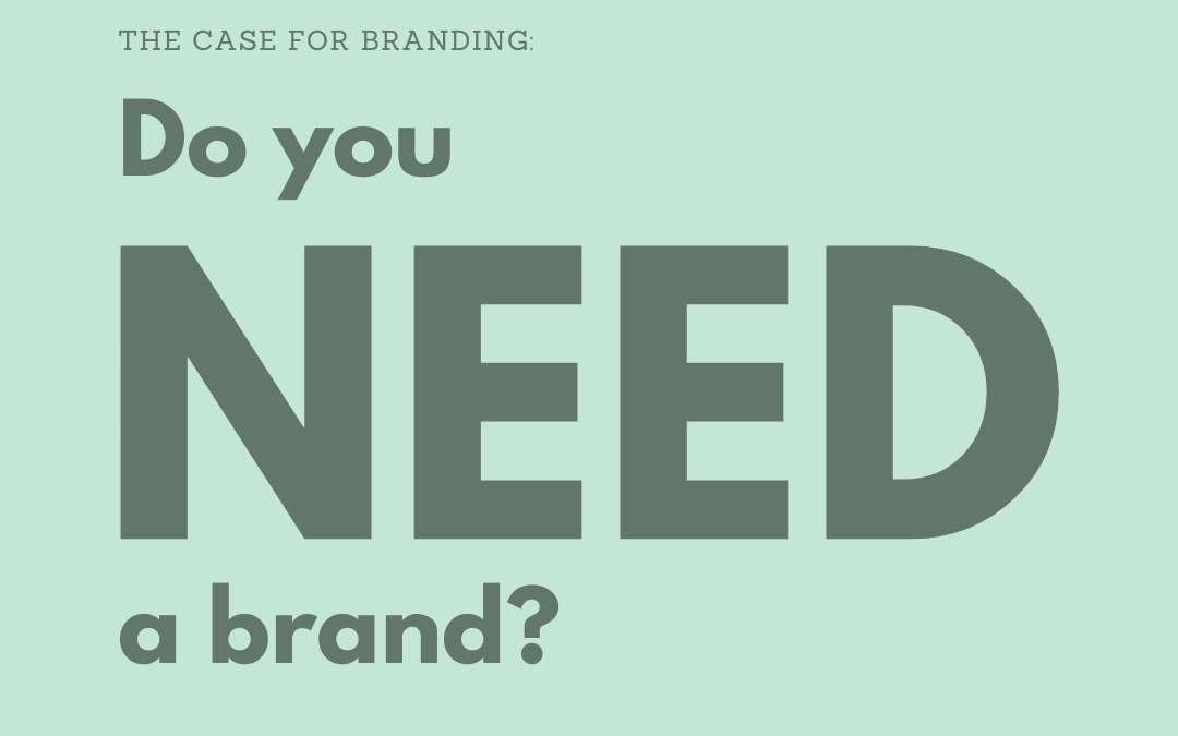
Feb 26, 2026 | Blog, Branding, Graphic Design
You’ve launched before. You’ve managed teams. You understand margins and market positioning. You’ve seen firsthand how perception influences pricing, trust, and growth. You already know brand isn’t decoration. It’s not a logo exercise or a vibe check. It’s a signal....
Oct 31, 2025 | Blog, Branding, Portfolio
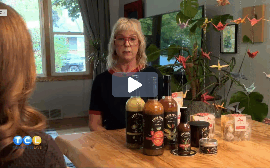
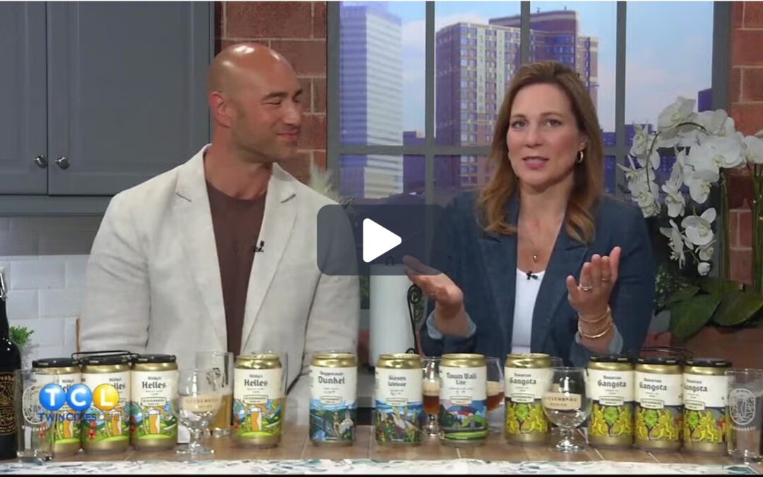
I had the joy (and a few nerves!) of welcoming the Twin Cities Live crew into my home office to share a bit of what Liina & Co is all about — helping small businesses grow through intentional, story-driven branding. We talked about how Liina & Co began, what...
Jun 26, 2025 | Blog, Portfolio
We love seeing local businesses in the spotlight — especially when it’s one of our favorites! Giesenbrau Brewery was recently featured by KSTP as part of their “Explore New Prague” series. In the interview, owner Erin Hutton shares the story behind Giesenbrau, their...
Jun 2, 2025 | Blog, Portfolio
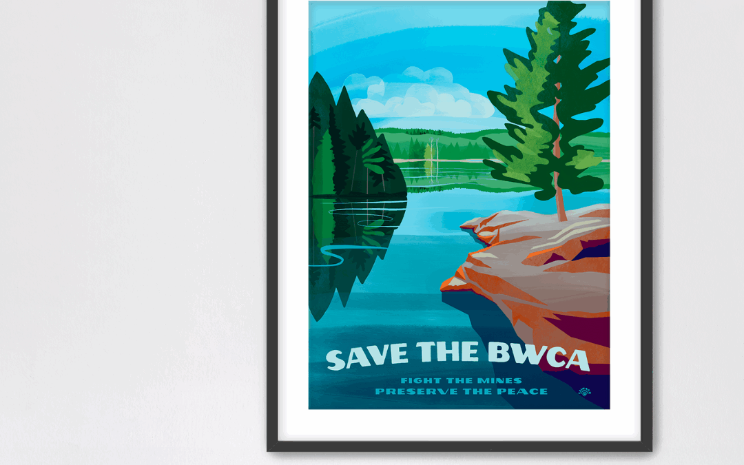
I’m excited to share a project close to both my heart and my home: the Save the BWCA poster, available now through Lulii Prints. This piece was created as a love letter to the Boundary Waters Canoe Area Wilderness—an incredibly special place that has inspired me for...
May 29, 2025 | Blog, Branding, Graphic Design, Logo Design, Portfolio
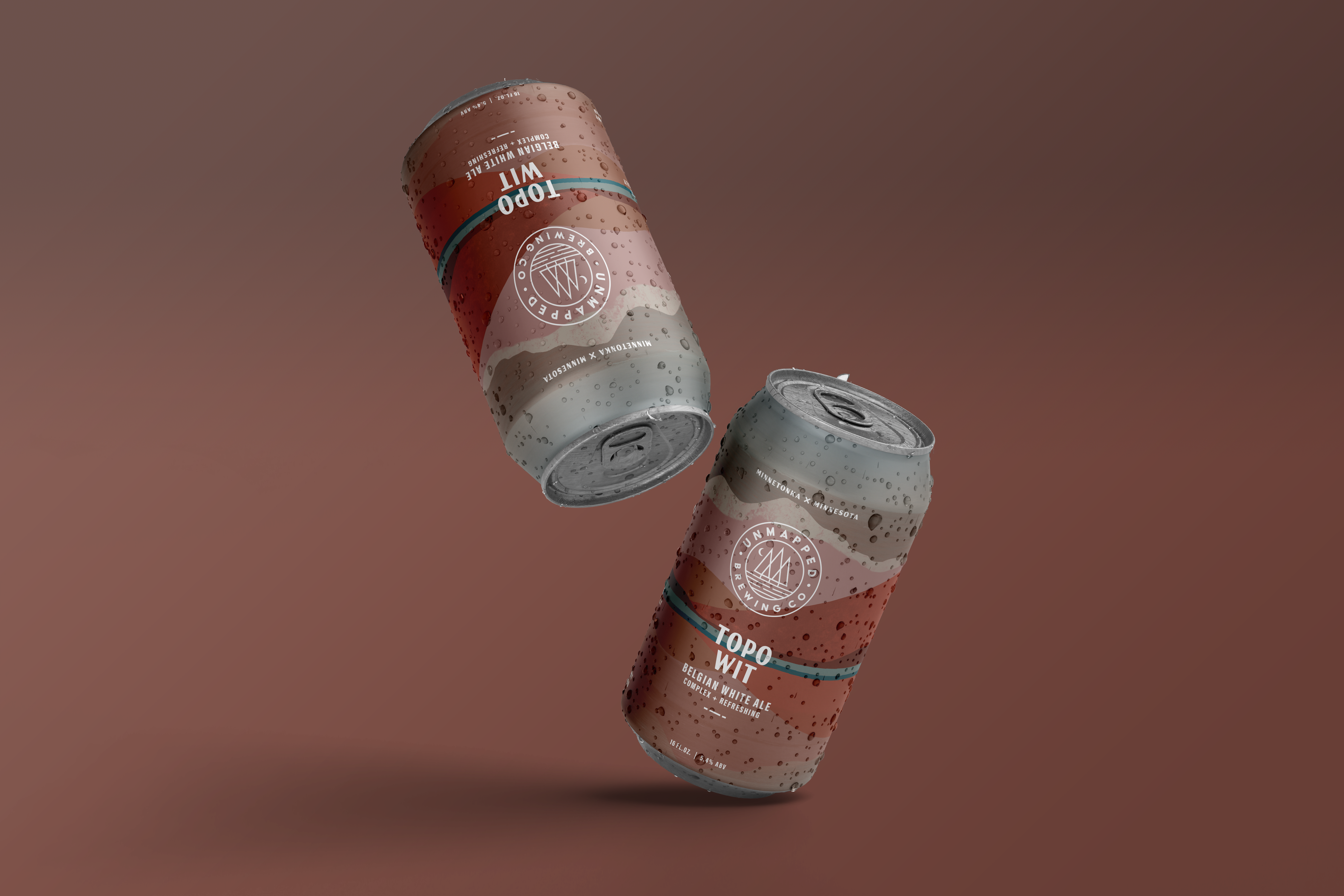
I’m excited to share a double dose of good news: Liina & Co has been recognized by DesignRush as one of the top branding agencies in Minnesota—and our work for Unmapped Brewing Co is being featured among The Best Branding Designs! With over 25 years of experience...
Nov 1, 2024 | Blog, Branding, Graphic Design, Logo Design, Photography Art Direction, Portfolio
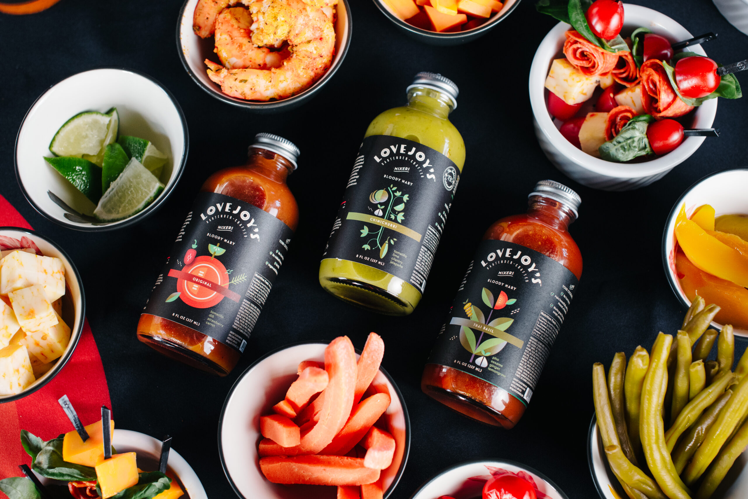
Photography by Tara Sloane A bloody fantastic rebrand… Every brand has a story, and my favorite part is excavating the energy and life of that story and bringing it to life. When done well, design has the power to intrigue the right audience, educate them on...
Aug 2, 2022 | Blog, Portfolio
Common thought: “I have a small business, so isn’t a small-budget, $100 logo good enough?” It’s tempting to cut down the cost of investing in your brand. It seems intangible. It can even seem superfluous. But before you do that, consider this: Your brand —...

Apr 24, 2019 | Blog, Portfolio
It’s not necessarily a step that seems crucial. After all, you have a business plan, right? You probably have some examples of certain brands and logos you like, right? So why bother taking this step? Lots of reasons. Here’s the short list: Nobody can see...